Longfellow Bridge Continues To Accumulate Horrible Sinage
Written by Boston Biker on Oct 07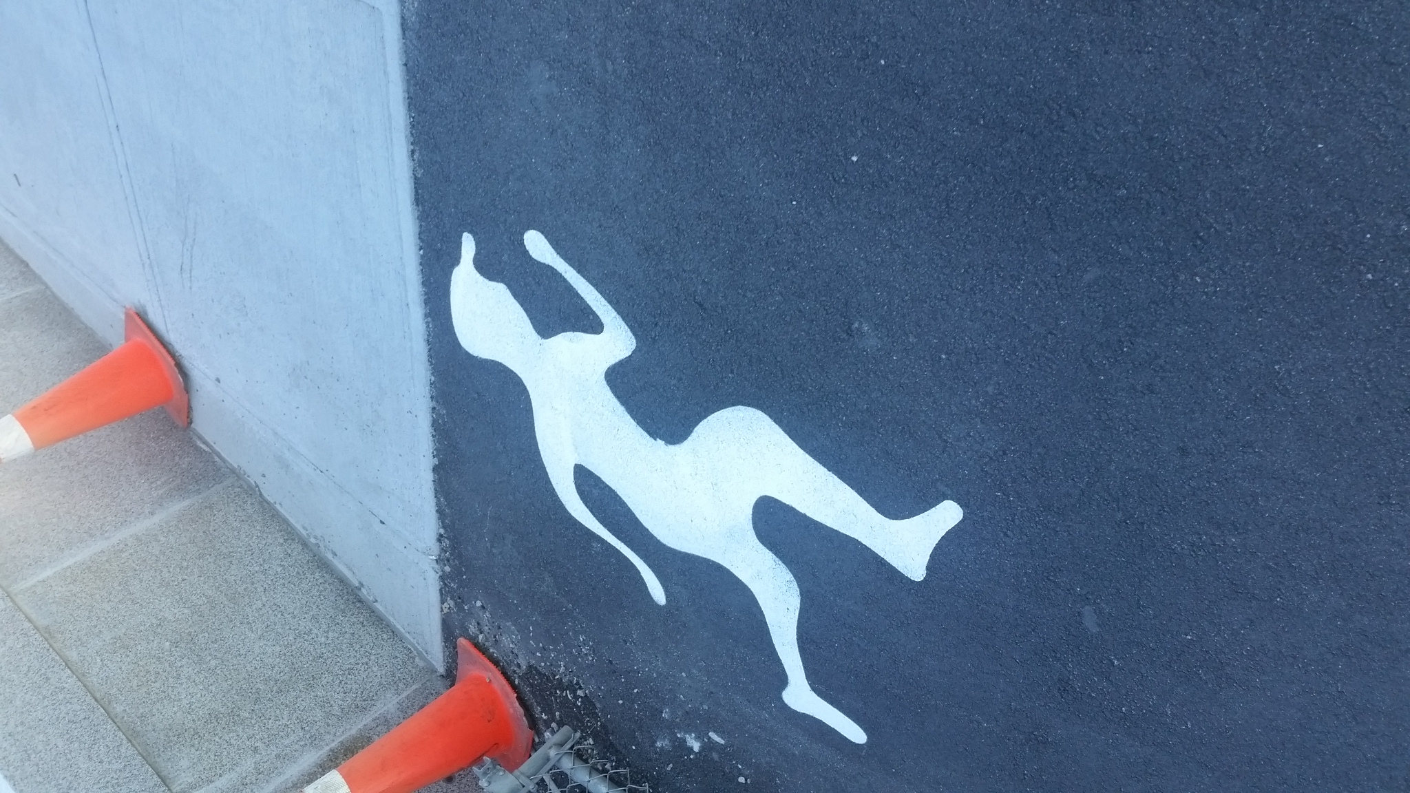
What the hell…so now they have put down some kind of jogging sharrows? It looks to me an awful lot like the juggalo logo…

…yea then there are these.
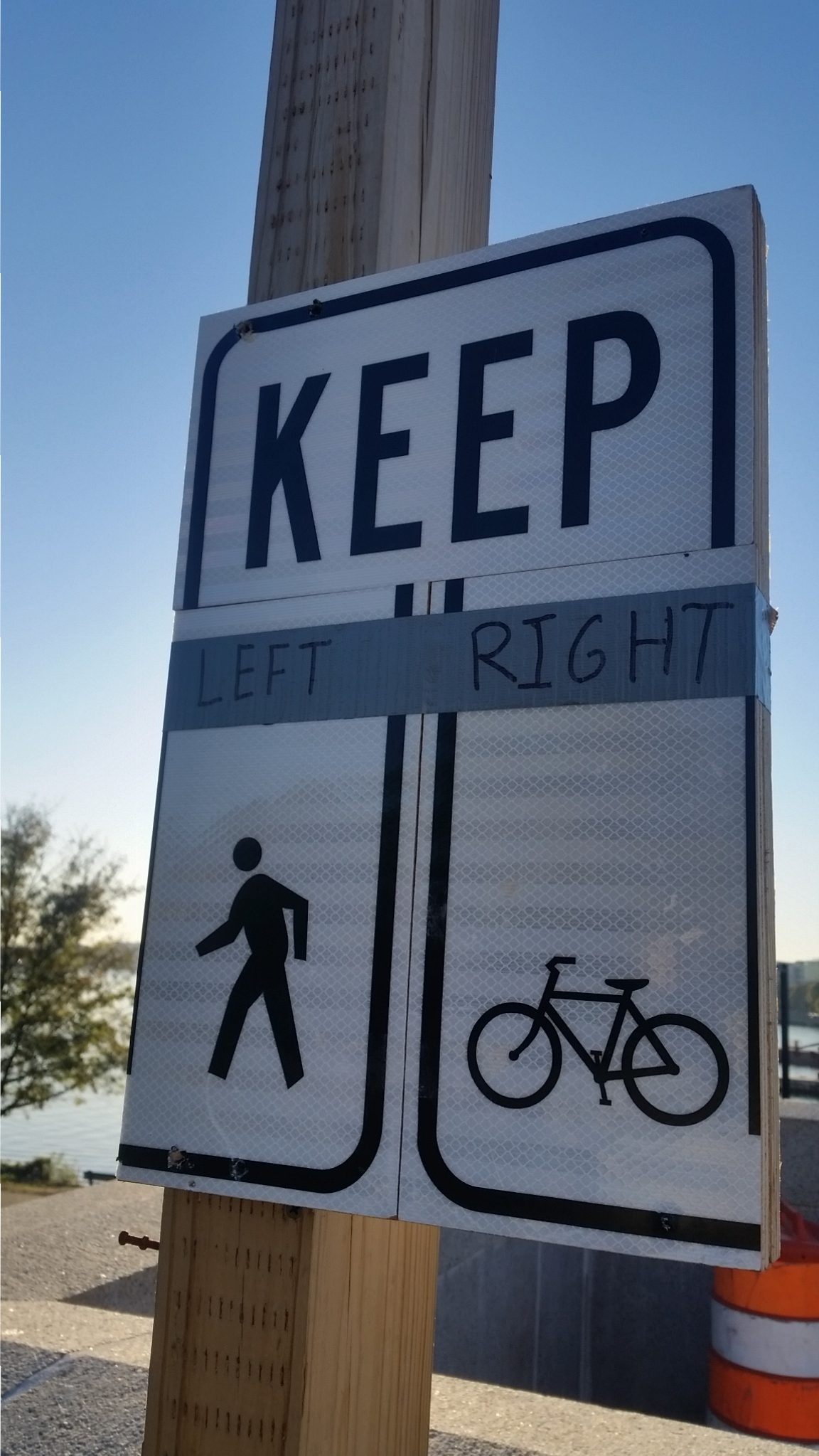
Literally three signs cut up and duct taped back together, with sharpie clarification…what the actual hell.
There is about seven of these all facing the Boston side. I guess the idea is that all the pedestrians are supposed to walk on one side of the tiny sidewalk that is currently being shared by cyclists and pedestrians.
Only about a million problems with this. There is no signs facing the Cambridge side, so people walking from that direction have no idea what is going on. Then there is the problem that…people walk on the right, its been put into their heads forever.
These are clearly not standard signs, they had to jury rig them together from parts. As far as I can see over the last couple days not a single pedestrian has noticed the signs (or they have seen them and not understood what they are supposed to do). No one is moving to the left, and no one gives a single shit about those signs.
This is like part four or five in the saga of “you can’t fix shitty design with signs.”
The solution remains simple, and has been the same since the construction started. CLOSE THE BRIDGE TO CARS, have cyclists ride in the damn road where they belong, and leave the sidewalk to the pedestrians, the road could still be open to emergency travel, and the whole thing would run so much smoother. The Longfellow has always been used by a majority of non-car users, and the infrastructure should reflect this.
 Add to Reddit.
 Tags: clusterfuck, Longfellow, poor design, signs
Posted in Commuting, infrastructure | 1 Comment »


Sorry, comments for this entry are closed at this time.